Tuesday 17 March 2015
Monday 16 March 2015
Evaluation Question 4 (Part 1)
Research & Planning:

Annotated film:
Annotated ancillaries:
 |
| We worked on the YouTube video annotoations as a group. |
Evaluation Question 3
Adrian on Themes and Styles:
Jamal on Titles and Target Audience:
Oli on Brand and Target Audience:
Evaluation Question 2
Scott's feedback:
Tom's feedback:
Adrian' analysis:
Jamal's analysis:
Oli's analysis:
Monday 9 March 2015
Friday 27 February 2015
Wednesday 25 February 2015
Double Page Spread Ancillary (Making Of)
 |
| Here is an example of a shot we directed Adrian to take. Though the angle is regarded as strange, we felt it would be good to use a variety of shots, focuses and angles when we collected all the pictures in the end and picked what we thought were the most appropriate ones for the film. |
 |
| Here I'm using the Burn & Dodge tool to manipulate areas of the image so darken/lighten them. If I thought the image needed a darker or grittier tone to it I went over certain areas with the Burn tool. If it became too dark, I reverted that with the dodge tool. |
 |
| This is a plan of the double page spread conducted on the programme "Pages". |
 |
| Here the text is being manipulated to make it look more visually pleasing, and aesthetic to the eye, There were a few things we regarded as "tacky" which we decided to omit. |
 |
| This is a separate image of a brick wall taken on site. We originally thought the lighting here wasn't great, so we took a picture of the chicken and another of the wall. We cropped and layered the chicken in front of the wall and used the "healing tool" to make it look like one image. However the general consensus of the group was that the brick wall would make the typography too difficult to read, so we abandoned this and stuck with the original image. |
 |
| As a group we went through the film to take any screenshots for stills we thought would make a good background image for the double page spread. However we didn't find anything worth using so we stuck with the original image that we deliberately took for the ancillary. |

Tuesday 24 February 2015
Double Page Spread Draft
This is a draft for our double page spread. The photo in the background is a representation of a still in the film, and I split up where the writing could be over the page. This is obviously a rough draft and is subject to change.

Thursday 19 February 2015
Final Ancillary (Poster)
Here is the final ancillary produced through photoshop and indesign. The font took a while to choose as there were so many, for both the title and billing board - we tried to stay away from stylised fonts, as well as "plain" fonts. The spacing of the words more or less fell into place.

Wednesday 18 February 2015
Friday 13 February 2015
Poster Final Draft
After exploring our options we decided to go with the poster that can be seen below. It is mainly based off Oli's draft of the poster as we found that it was the most effective and induced a little bit of narrative enigma.

As you can see, the poster is still missing the title. This is because we yet have to decide on one. After the change from Sweets to Diamonds the title 'For a handful of Sweets' obviously doesn't work anymore.
At the moment it looks like we will go with 'For a Handful of Rocks', but this is not 100% decided yet.
Thursday 12 February 2015
Poster Draft #3
Here is a rough sketch of what our film poster could look like. We took some photos at one of our shoots to get the photos for the ancillaries.

Poster Draft #2


Another idea for a poster originated on the stereotypical mug shot. This links to the Villain/robber theme of our movie:

Tuesday 10 February 2015
Poster Draft #1
With everyone presenting an idea for our poster, this is what I came up with:

I wanted to show the three characters, all facing away from each other. This tells someone looking at the poster immediately that there is a conflict between the three. It also introduces all the characters.
Friday 6 February 2015

Thursday 5 February 2015
Short Film Poster Analysis #3

Multiple layers have been seamlessly combined which adds death and interest.
Light and dark areas have clearly be carefully considered when combining a variety images and text together. When adding text onto our posters we need to be mindful of the background and text colours.
Relevant hints relating to the film displayed though the cleverly implemented cross word puzzle and mis-en-scene.
Hiding the characters characters identity creates mystery and narrative enigmas.
The white credits stand out on the dark blue surroundings.

3 close ups displaying the main characters.
A single photograph fills the poster while the three main characters over laying the top half . The image has clearly been manipulated to create this saturated grainy feel.
The colour palette can bee see in the three main characters as there bodies fade into the surrounding clouds connoting death and loss.
Ultimately what i have found is the majority of the successful posters and reasonably simple and to the point in dressing relative narrative.
Wednesday 4 February 2015
Short Film Posters Analysis #2
Feature Length Poster

Short Film Poster

Similarities:
- Close ups.
- Reveals Mise En Scene (related to close ups?).
- Title relates to the film somehow.
- Billing Board present.
Differences:
- Close ups are graphically contrasting. Drive includes a filter and is taken from the film. Curfew has two simple close up shots purposefully chosen for the poster. Could be to do with the simple techniques that short film purport.
- The feature length movie has a longer billing board.
- The short film has no mention of the casting in bold, unlike the feature length film which explicitly states "Ryan Gosling" as a selling point.
- Instead, the short film displays in bold the movie and culture festivals it was shown at and won at for "Best Short Film".
Tuesday 3 February 2015
Short Film Poster Analysis #1

Looking at these two posters of short films, we can observe the following similarities:
The protagonist is not clearly identifiable
However, this is not necessary as the protagonist is most likely played by an unknown actor. Showing their face would therefore not attract fans of said actor due to the lack of his publicity. Instead, hiding the face creates an enigma which the audience will want to see solved when watching the film.
Plain Background
This puts the focus on both the artwork and the title. In addition to this it makes the designing process of the poster easier and by that often cheaper.
Images fit the title
For the poster to raise interest in a potential audience it needs to make sense at the first glance.
Title stands in the foreground
The title, in combination with the image(s), forms the most important part of the poster.
Catchphrase
As we can see, the poster on the right has a catchphrase on it. The purpose of this is that somebody who sees the poster will remember the film because of the witty sentence.
Billing
Similar to feature film posters, short film posters list the names of people and organisations that have taken part in the production of the film.
Monday 2 February 2015
Short Film Posters Intro
Today we had a conversation with our Media teacher about the characteristics of short film posters.

We talked about:
- Positioning of the title
- Billing (ie. credits)
- Focus on the protagonist/the actor who plays him
In the following posts we will go into depth how different short film posters were designed.
In the following posts we will go into depth how different short film posters were designed.
Thursday 29 January 2015
Wanted: Film Title
With diamonds now replacing the sweets as loot, we had to think of a new title for our film.
We wanted to stick with the reference to the Fistful of Dollars films, so we started brainstorming.
As you can see we didn't go for the obvious choice of "Handful of Diamonds", but instead thought about other words that can be used to describe diamonds.
In the end we went with 'For a Handful of Rocks', with rocks being a colloquial term for diamonds. We found this more fitting as you would think of the robbers as being of a lower social class as shown e.g. by the location and their getaway car, and thus expect them to use a slang term to describe the diamonds.
The idea was to give somebody looking at the poster, or just hearing about the film, an impression of what kind of film this is.
We wanted to stick with the reference to the Fistful of Dollars films, so we started brainstorming.
 |
| Mind-map showing our brainstorming. |
As you can see we didn't go for the obvious choice of "Handful of Diamonds", but instead thought about other words that can be used to describe diamonds.
In the end we went with 'For a Handful of Rocks', with rocks being a colloquial term for diamonds. We found this more fitting as you would think of the robbers as being of a lower social class as shown e.g. by the location and their getaway car, and thus expect them to use a slang term to describe the diamonds.
The idea was to give somebody looking at the poster, or just hearing about the film, an impression of what kind of film this is.
Friday 23 January 2015
Inspiration for our soundtrack
As we changed our film we decided to change the music too, since our original stuff didn't work as well. The inspiration that we took is music that is oxymoronic with the scene it is being played to. For example, in The Punisher there is a fight scene with Opera music playing. We thought this type of music would contrast nicely with the film itself.

As well as this scene, when I read "A Clockwork Orange", the main character - Alex, commits violent acts when he hears any classical music such as symphonies performed by Mozart or Beethoven. The classical music can be a representation for the violence that occurs during the film.
Thursday 22 January 2015
Soundtrack For Our Film
Today we had a look on the internet for copyright free music.
Here are the three websites we went on to look for copyright free music:
incompetech.com
audiomicro.com
proudmusiclibrary.com
One piece of music that we agreed would fit our film particularilly well is 'Beethoven – Egmont Overture Op. 84)'.
As we found out though, even though the Beethoven's music is copyright free, the performance itself may be copyrighted.

We will therefore have to be careful not to use copyrighted material or might have to seek permission to use the music.
EDIT: In the end we managed to find a version of the piece that we were allowed to use.
Here are the three websites we went on to look for copyright free music:
incompetech.com
audiomicro.com
proudmusiclibrary.com
One piece of music that we agreed would fit our film particularilly well is 'Beethoven – Egmont Overture Op. 84)'.
As we found out though, even though the Beethoven's music is copyright free, the performance itself may be copyrighted.
We will therefore have to be careful not to use copyrighted material or might have to seek permission to use the music.
EDIT: In the end we managed to find a version of the piece that we were allowed to use.
Editing our Film
The editing of our film is now well underway, so I decided to make a post about the software I am using: Final Cut Pro X. I'm explaining the most important tools in FCPX in the image below.

Saturday 17 January 2015
Reshoot Day 3 (Recap)
Today we filmed the inside scene. With this being the main part of our film, we had to plan in the most time for it.
Here is a timelapse video, showing some of the filming we did on the day:
With all of the filming finished, we are moving on to the post production stage now!
Here is a timelapse video, showing some of the filming we did on the day:
With all of the filming finished, we are moving on to the post production stage now!
Sunday 11 January 2015
Reshoot Day 2 (Recap)
Today we went back to the Windsor Great Park to re film a couple of unsuccessful shots. After reviewing the previous day's footage of the opening scene, some of the shots either looked unnatural (e.g a shot of Jamal jumping over a pole) or it just didn't fit the feel we were going for. We also came up with a few more ideas for alternative shots while discussing the day on Whatsapp the night before.


We then drove over to Stoke Poges, a remote rural town next to Slough, which as you can see from the Google Maps picture above took around 30 mins to get to. We also ran into some navigational issues on the way and we somehow managed to enter Pinewood Studios!
One hour later we finally arrived where we wanted to be. The quiet windy roads allows us to obtain a variety of interesting shots depicting us as we escaped from the heist.
We then filmed the drop off point where the robbers get out the car and walk into there hide out. In the previous test shoots we instinctively pulled up outside the house, however our audience feedback revealed that the residential environment surrounding the location didn't fit the rest of the film. We feel this new drop off point makes for a more suitable environment to exit the car. The picture bellow shows the area we decided on.
Saturday 10 January 2015
Car Scene Research
When we shot the car scene a few days ago we found that we were lacking in shot variety so I decided to do some research into movies which executed these shot particularly well.
 |
| We could easily replicate this shot by placing the camera on the back of Bradley's boot. |
 |
| We had a shot similar to this one in our test shoot which proved to be a pleasing shot that we hope to also implement into our short film. |
DIY Steadicam
Since we don't have the budget for a camera track (or even a professional steadicam), I built this DIY steadicam out of a tripod and duct tape to ensure a steady shot for when the camera follows the running robbers.
The inspiration for this came from this video which I found when looking online for new techniques that can help us improve the look of our footage.
The inspiration for this came from this video which I found when looking online for new techniques that can help us improve the look of our footage.
 |
| Me holding my DIY steady cam. |
The result can be seen below:
Reshoot Day 1 (Recap)
Today was the first day of our reshoot-marathon.
Starting with the opening scene, we filmed in a completely different location – in the Windsor Great Park.
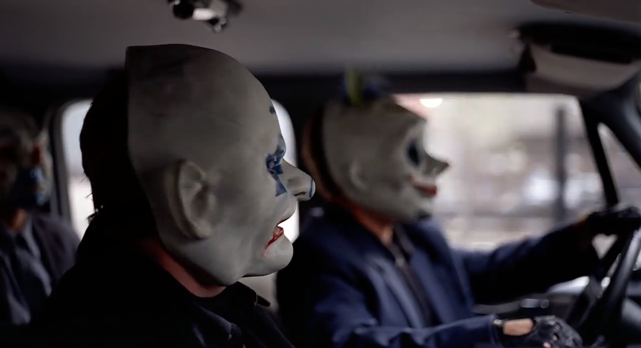
Here we found a great place to shoot our first scene showing two of the robbers running away from where they stole the loot while the third one of them is waiting in the car, acting as the getaway driver.
But what would a day of filming be without some challeges to overcome?
Starting with the opening scene, we filmed in a completely different location – in the Windsor Great Park.
 |
| The Windsor Great Park is only a good 10 minute drive away from our main shooting location. |
Here we found a great place to shoot our first scene showing two of the robbers running away from where they stole the loot while the third one of them is waiting in the car, acting as the getaway driver.
 |
| The Windsor Great Park at its most beautiful. |
 |
| After climbing over this fence, the robbers make their way to the car. |
 |
| This is the distance the robbers have to run: Long enough to allow us to shoot from a variety of angles and distances. |
 |
| While Chicken and Horse are fleeing from the crime scene... |
 |
| ...Pig is waiting in the car, ready to drive off. |
But what would a day of filming be without some challeges to overcome?
As it turned out we needed permission to film in the park, so we were stopped by the Park Rangers. After a short conversation everything was fine though, as they allowed us to continue filming as long as we inform them the next time we are planning to come there.
Tonight I will create a rough cut of the first scene. The plan for tomorrow is to reshoot any shots that need fixing as well as adding any that are still missing (e.g. a shot of the car driving away).
Look what we did to ensure steady footage throughout the running sequence!
 |
| The friendly Park Rangers |
Tonight I will create a rough cut of the first scene. The plan for tomorrow is to reshoot any shots that need fixing as well as adding any that are still missing (e.g. a shot of the car driving away).
Look what we did to ensure steady footage throughout the running sequence!
Thursday 8 January 2015
Film Riot's Guide to Preparing for Shooting a Short Film
Today, our constant source of inspiration and tips & tricks, Youtube channel Film Riot, uploaded a video that deals with the preparation for shooting a short film:
So, what can we take away from watching this video?
- Preparation is key
- It's important to know what equipment is available and how to use it
- A well thought-through and planned out storyline is essential
- Everyone on set needs to know what his job is
So, what can we take away from watching this video?
- Preparation is key
- It's important to know what equipment is available and how to use it
- A well thought-through and planned out storyline is essential
- Everyone on set needs to know what his job is
Monday 5 January 2015
Reshooting our Film – Time Management
As a result of the audience feedback that we have received we decided to reshoot our film.
Here is the the calander showing how we are planning to proceed:

Here is the the calander showing how we are planning to proceed:
A New Beginning

The overall consensus was positive, however most were confused by the narrative as well as the fact that the loot consisted of sweets. The ending was also pointed out to be quite bland without much of a twist.
One person mentioned that the theme of the film does not match the one we had aspired, not being dark and serious enough.
As a consequence of this feedback we decided on the following:
- We will refilm the movie, using fake diamonds rather than sweets.
- We will add a scene at the beginning, explaining how the robberes acquired the loot.
- There will be a different ending with a more intriguing twist.
- The theme of the film will be darker and grittier.
Subscribe to:
Posts (Atom)